Content Design
Language systems for brand new interfaces
The most constrained writing surfaces I know aren't on 2D screens, but in 3D space. I spent years designing language for augmented reality and AI-led wearables at Snap and Meta, working in environments where language does heavy lifting.
Here’s a sample of that work.
Defining the voice of a spatial AI agent
At Meta Reality Labs, I authored the first content and behavioral guidelines for AI-led conversational agents on wearable AR devices — a product category with no precedent and no existing style guide.
My role
Creative Director
Surface
AR wearables · Conversational AI
Output
Voice system + behavioral principles
The challenge
How does AI interact when it's visible and spatial? When it sees what you see and hears what you hear? This AI moves through your space, speaks into your ear, responds to your environment, and has to earn trust and demonstrate utility in seconds.
Selected principles from the guidelines
Set clear expectations
If users expect AI to be infinitely capable, they'll be disappointed. Language establishes what the AI can and can't do upfront — building trust rather than eroding it.
Example string pattern
"I can help with [X]. For [Y], you'll need to..."

Keep it brief & interruptible
Long AI monologues make users feel trapped. I defined a maximum utterance length and required check-in phrasing at natural pause points so users always feel in control.
Example string pattern
Speak in short chunks. End each with: "Want me to keep going?"
Reinforce voice with visuals
Spoken language alone can be hard to track. I defined when the AI should display key information as on-screen text simultaneously, providing a visual anchor to assist with recall.
Example string pattern
"Which would you like to try?" — list options spoken and displayed simultaneously as a visual prompt

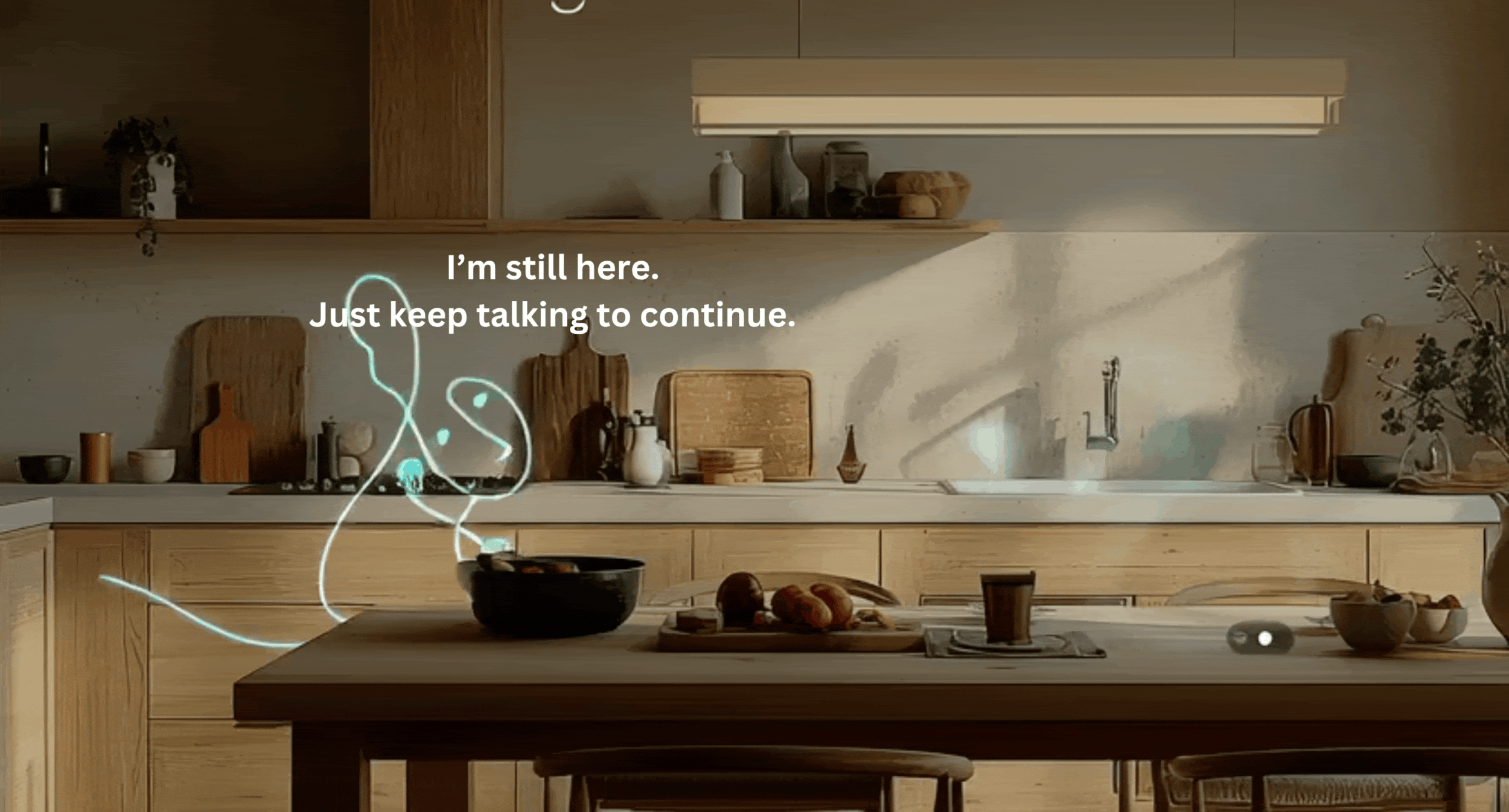
Remind users to keep talking
Users new to conversational AI aren't used to progressing through voice. I specified recovery strings — patient, friendly prompts for when a user goes quiet mid-session.
Example string pattern
"I'm still here! Just keep talking to continue."
Demonstrate contextual awareness early
Contextual awareness is an XR AI's superpower. I required the agent to reference the user's environment within the first interaction, to pique interest and build trust immediately.
Example string pattern
"I can see you're in a bright space — good room for this."

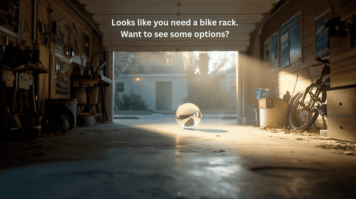
Be proactive, not pushy
Especially for users new to XR, contextually relevant hints can feel magically helpful. I wrote guidance on when the AI should offer suggestions unprompted, that feel assistive rather than intrusive.
Example string pattern
"Looks like you might be trying to [X] — want a hand?"
This exercise wasn't writing individual strings, but building the system that governs all of them. The full guidelines cover 15 behavioral principles across state management, tone modulation, error handling, multimodal support, and spatial orientation for wearable form factors. Available to discuss in detail.

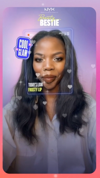
Beauty Bestie: from "cringe" to clarity
NYX Professional Makeup wanted to extend their social media voice into a first-to-market AI-powered AR makeup product. UXR told us their slang-heavy tone of voice was actively hurting trust. I built a content framework to fix it, and the product went on to reach 91.6M users.
My role
Creative Director · Content Lead
Surface
AR mobile · Snapchat camera
Constraints
Social context · Ad format · Ages 13+
Key goal
Trust · personalization · purchase
The problem
The brand wanted to use its social voice, which was slang-infused, trend-dependent, and first person, used in a very different context than Beauty Bestie. UXR confirmed the tone felt "cringe" to users — overly intimate and too colloquial to take seriously.
Overly intimate
Assumed a relationship that didn't exist yet
Unprofessional
Non-standard language hurt credibility
Not scalable
Trend-dependent slang can't govern a product
Rather than applying a neutral tone across the product, I built a framework for deciding when the brand voice could be playful and when it needed to step back.
Play is allowed in moments of:
· Low cognitive load — no active decision-making
· Low risk — no impact on outcome or trust
· System state beats — waiting, loading, generating
Example moment
Anticipation state while a makeup look is generating (3 sec wait)
Clear & lightweight language leads during:
· High emotional load — user is processing a result
· Moderate-to-high stakes — moment matters to the user
· Action moments — opportunities for commitment
Example moment
Look reveal + post-reveal CTA
Users waited an average of 3 seconds while their custom look generated, a moment of pure anticipation. Cognitive load was low, no action was required, and there was no impact on outcome. More room to play.
I wrote warmer, more informal copy to signal the system was working.

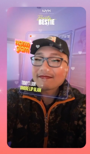
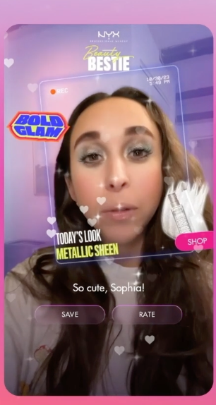
The "look reveal" is a high-stakes payoff moment that rewards the user's patience and trust. I stripped copy to a miminal, consistent label (Today's Look: [name of look]). I shifted more playful energy into peripheral stickers, heroing the user's face front and center.
I sequenced a personalized second beat — "So cute, [name]" — after the reveal moment. Action buttons followed, inviting purchase without pressure.
Results
91.6M
Users in first few months
84%
Retention · users returning multiple times
$8.2M
Incremental sales (Nielsen)
The core content design challenge here wasn't writing individual strings — it was building a framework that could govern all of them. "Mapping Moments for Play" gave every future content decision a principled foundation: not is this on-brand, but does this moment earn the brand voice.
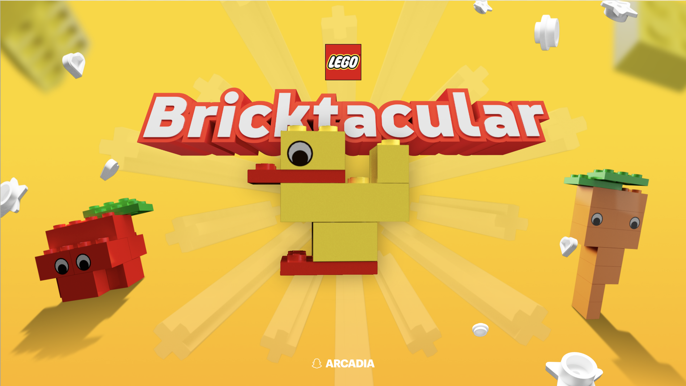
Bricktacular: teaching XR gameplay through progressive onboarding
LEGO's Bricktacular was the first branded app on Spectacles (Snap's AR & AI glasses). It was also the first AR game to use new gestures (like "pinch"), voice control, and dual hand interaction, which users had to learn before they could play. I designed a progressive content system to get them there without losing them first.
My role
Creative Director · Content Lead
Surface
AR & AI wearables + mobile · 14 countries
Constraints
Gesture + voice · 5 languages · Ages 13+
Key goal
Drive repeat player sessions
The problem
Before users could play, they had to learn entirely new interaction models: gesture and voice controls in a spatial environment. That's a tough barrier to entry — peak cognitive load, when the value of the product hasn't been proven yet — and early drop-off was threatening retention.
New interaction models
Gestures and voice were unfamiliar, requiring onboarding steps
Blank slate anxiety
UXR confirmed: no clear building prompt was causing early abandonment
Learning before value
Users had to invest effort before the product could deliver its payoff
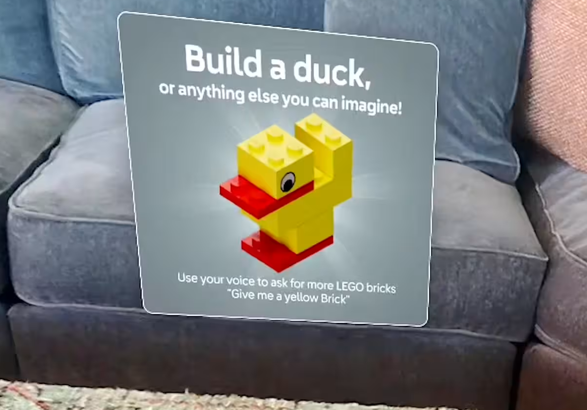
Rather than front-loading instructions, I embedded learning into the experience itself — one concept at a time, reinforcing through use, stepping back once the player had the hang of it. Each hint was built from the same 4-part string anatomy:
String anatomy: the 4 layers of every hint
① Primary prompt
One clear prompt — a concrete starting point.
"Build a duck."
② Optional variation
Opens creative latitude without requiring a choice.
"Or anything else you can imagine."
③ Interaction setup
Introduces the mechanic in context of the active challenge.
"Use your voice to ask for bricks."
④ Example behavior
Provides an exact script, removing all ambiguity.
"Give me a yellow brick."
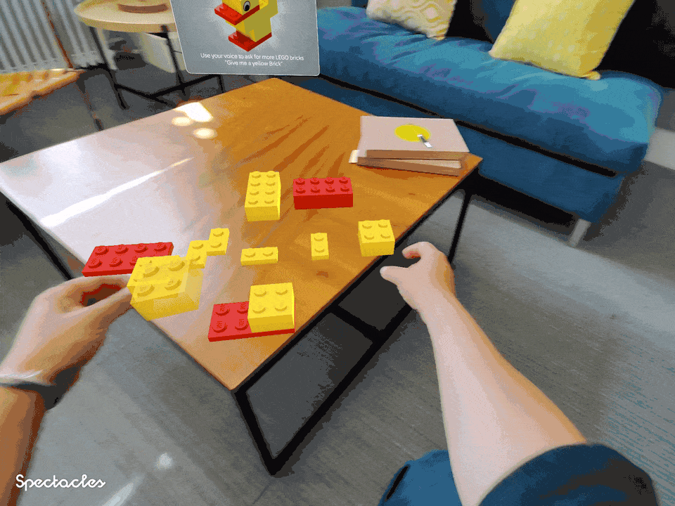
On Spectacles, there's no touchscreen fallback — only gesture and voice. The initial hint had to eliminate the blank-slate effect with a single, clear prompt. Then, lower in hierarchy, it introduced the voice control layer in context. (Voice control enhanced the experience, but wasn't essential.)
The "optional variation" layer ("or anything else you can imagine") reinforced LEGO's core belief that there's no "right" way to build.
This hint fired after a pause in active gameplay, after a player had already made their first successful move. It built on the same hint pattern, layering complexity onto a behavior the player had already performed.
The user-centric framing ("Builder's block?") framed the hint as solving the player's problem, not as system instructions.

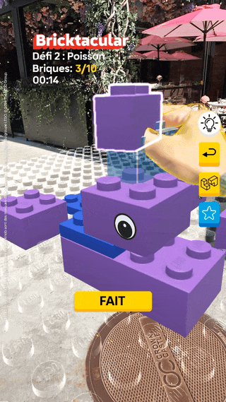
Once gameplay began, the content system receded. Any guidance heavier than essential status indicators would interrupt the flow. I surfaced three key elements: Challenge Name, Bricks Remaining, and Timer.
After build completion, I introduced two follow-up options to drive continued play. Limiting choice prevented friction at the moment of highest motivation. The strings were also designed to localize — short, direct, no idioms.
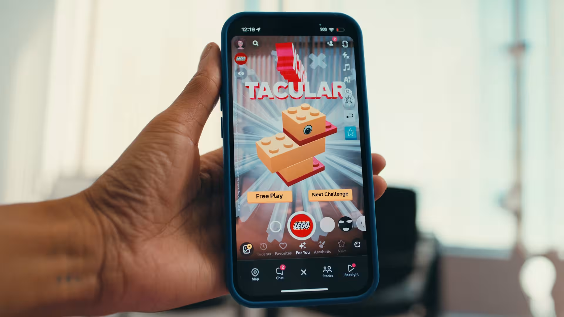
Results
14
Countries at launch
5
Languages
#1
Most-covered app at Spectacles launch
The content challenge here was sequencing — knowing not just what to say, but when to say it and when to get out of the way. The 4-part hint anatomy gave every string consistent structure. The 3-stage framework met users in the moment: getting started, building confidence, then stepping back to let them play.

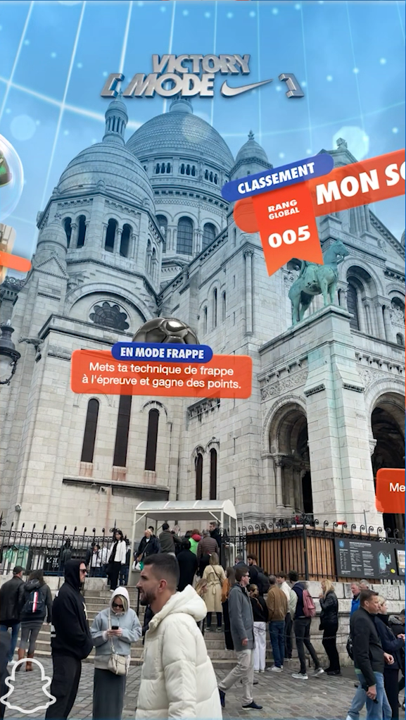
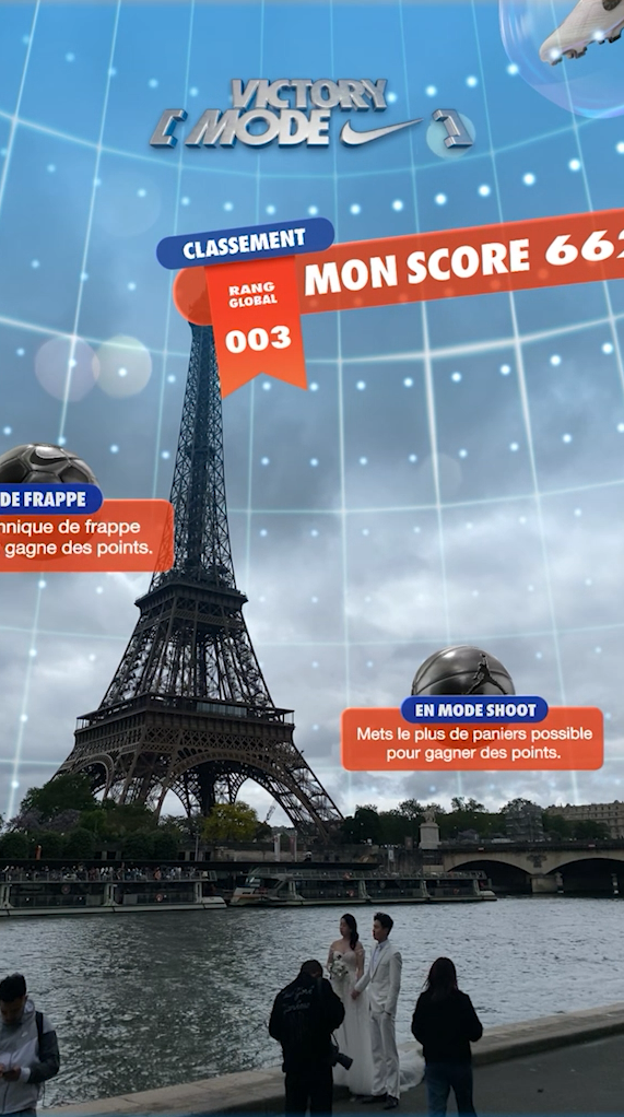
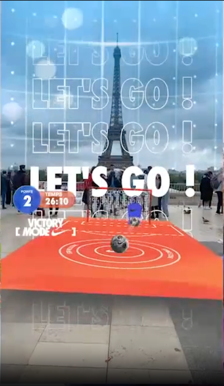
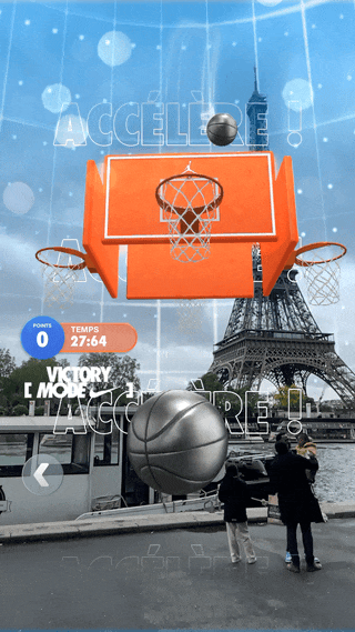
Victory Mode: writing for competition — in two languages
During the Paris Olympics, Snapchat and Nike launched an AR competition pinned spatially in the sky above the city. I designed the content system to orient users in a novel spatial environment, motivate competitive play, and scale cleanly to French.
My role
Creative Director · Content Lead
Surface
AR mobile · Snapchat camera · Paris
Constraints
Novel spatial UI · EN + FR · Nike brand
Key goal
Stoke competition · level playing field
The problem
Users were entering a spatial environment they'd never seen before — a "menu" of game options pinned in the sky — with no prior context for how it worked or why they should compete. At the same time, Nike required strings that actively motivated competitive mindsets, not just neutral wayfinding. And everything had to work in French.
Novel environment
Brand requirements
Preparing for localization
Two principles governed every string. First: repeat the core goal (earn points and climb the leaderboard) across every screen. Repetition in a competitive context builds motivation. Second: write strings that translate well.
Principle 1
Intentional repetition
If a string can reference points or the leaderboard without feeling forced, it should.
Principle 2
Localization-first writing
Tone should survive translation. If a string relies on wordplay, rethink it.
Players scanned the sky to discover a spatial menu of game options. Every string at this stage had to both orient users in a novel environment and make them want to win. Short, active verbs ("show") and reptition of goals ("win points") stayed translation-friendly.
During gameplay the priority was intensity and focus — short, high-energy, universal phrases of encouragement.
Nike's mandate to center motivation and competitive stakes could have overcooked the content. Happily, optimizing strings for localization forced a brevity that served players, our translator, and ultimately Nike too.

LiveNation: reframing the camera as a navigation tool
Festival-goers use Snapchat as their primary camera, not a navigation app. When LiveNation and Snap built AR wayfinding into the camera, I had to solve a content problem: how and when do you orient the user to this new camera use case?
My role
Creative Director · Content Lead
Surface
AR mobile · Snapchat camera · geofenced
Constraints
Misaligned user intent · live environment
Key goal
Minimize time finding friends
The problem
Most festival-goers opened their Snap camera expecting to take photos — not navigate. The AR wayfinding feature triggered automatically inside the festival geofence, so users arrived with a mismathced mental model.
Misaligned intent
Users opened the camera to capture, not navigate — wrong mental model
No prior context
The geofence trigger gave users no opt-in or warning.
I used an on-open introduction card to do the reframing before the user encountered the wayfinding UI. This card named the value proposition immediately, set accurate expectations, and required explicit acknowledgment before advancing.
The acknowledgment tap created a moment of conscious intent alignment.
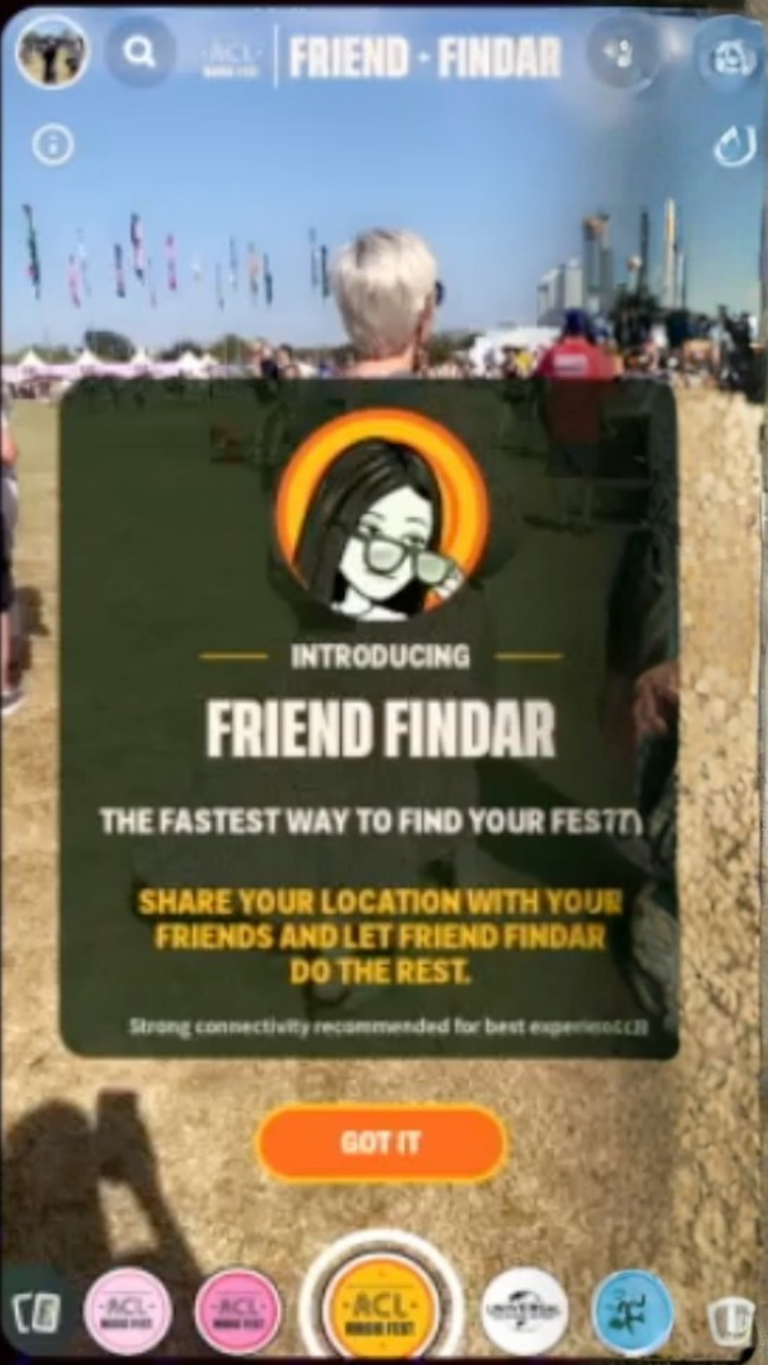
Image quality limited — product is no longer live.
Once inside the navigation tool, the content challenge was radical reduction. Given the live, crowded environment, and the new mental model, the wayfinding arrow needed to be the dominant element. I reduced the UI to three data points:
Proximity
Distance to friend — the only thing that changes in real time and drives action
Identity
Friend's name — confirms you're heading toward the right person
Recency
Timestamp — signals recency of location data
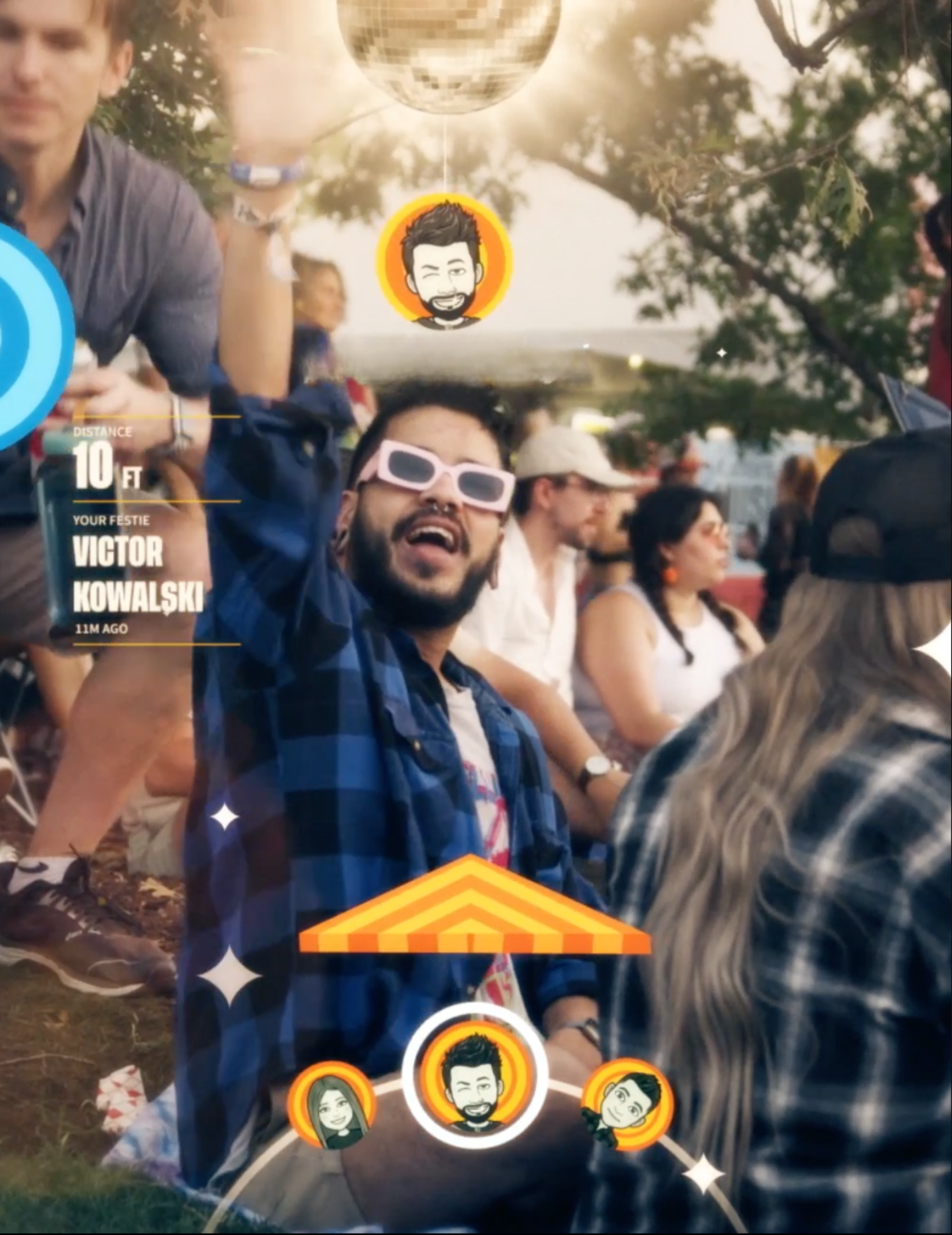
The content work here was surgical. The entire user experience hinged on deliberate decisions about what to say, what to cut, and what order to say it in.